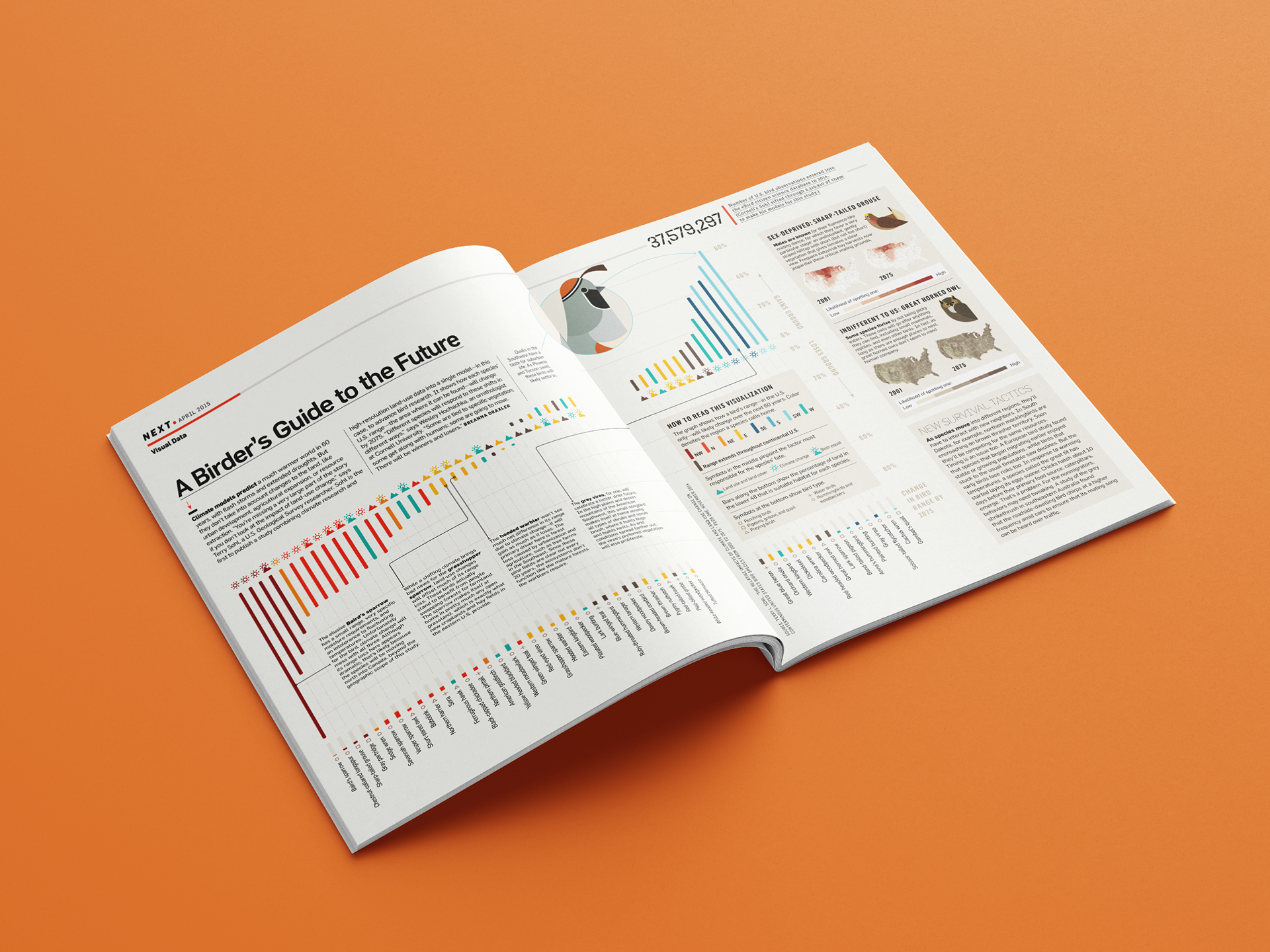
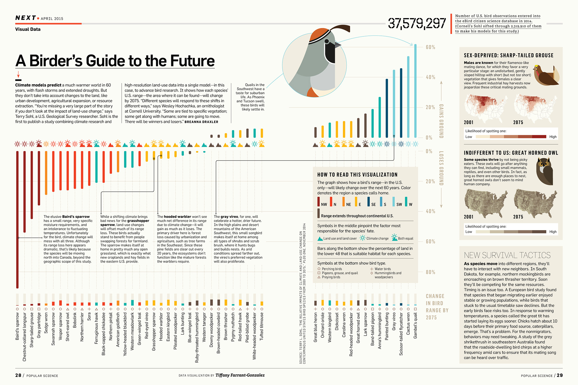
This graphic created for the April 2015 print edition of Popular Science magazine, visualizes how land-use and climate change are impacting bird life across the USA. The increase / decrease of a bird's range is plotted alongside the main driver behind this change (e.g. climate, land-use), the region in which the bird primarily resides and the total percentage of land in the US suitable for each species. (Region maps by Katie Peek)